Thursday, 26 August 2010

Layers Magazine


I really like this website as it gives a professional opinion on how you conquer certain Adobe programs for PC/ MAC.

If I have any problems or need a free trial to purchase a new and updated version on a program I like to go on this website first to see what I am dealing with and have a little play on it first.

The tutorials that you can have a go on are:

Photoshop CS5
Illustrator CS5
Dreamweaver CS5
Flash CS5
Indesign CS5
After Effects CS5
Premiere Pro CS5

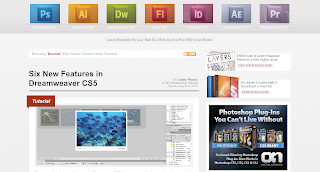
Here is a print screen from the front online page below:
Student D&AD Awards


This website I have been following for quite some time. I always use this website as a source of new goings on in the design world. I find it very inspirational and use some of other peoples ideas and integrate them in to my own work.

You can see all different pathways including:

Graphic Advertisement
Communication
Photography
Packaging
Moving Image
Illustration
Posters
and many more...

It's a good website as you can start to see what kind of goals you should be setting yourself in your own work.

It shows you the winners of live briefs that have been set throughout the year and the most modern creative design.

Graphic Design Employment

This website is very useful for students, employers, employees etc of the graphic design industry. I have found it very useful for its shortcuts and tutorials. I would recpmmend this to anybody in the design business.

At Graphic Design Employment.com, You'll find:

  • Graphics tutorials in InDesign, Photoshop, Quark XPress and Illustrator
  • Advice about preparing a CV or resumé and how to prepare for a graphic design job interview
  • Step-by-step guides to preparing press-ready artwork
  • Tips and advice on proofreading and the most common proofreading marks
  • Links to useful design-related websites and resources which are used in my studio on a daily basis
  • Where to find graphic design employment

It's my experience that much of this basic training has been neglected by college tutors. There's a good chance that you'll already be familiar with some of the information on this site - but I'm confident that you'll find a lot of new material as well. I hope that you find this website of use, and that you get as much out of the creative process of graphic design as I do. Check out the links on the left and below to start getting up to speed...

Crogen Coach House


Just before the holidays started I went on a family weekend holiday for my Grandad's 70th birthday. The house itself is called Crogen Coach House and is based in Wales, Corwen.

Dating back to 1380, Crogen is a Grade II star listed building. The front of the house displays gothic architecture with many original features. The rest of the house dates to 1837.

The gilt work to the ceiling in the dining room, large stone fireplace and mahogany floor have remained unchanged. With 14 bedrooms, drawing room, dining room, numerous sitting rooms, original kitchen (with larders and pantry), cellars and magnificent grounds.

Apparently it is said that this exact house used to be Queen Victoria and husband Albert getaway house. Her exact words were, "We've arrived in paradise."- Queen Victoria visiting the estate in 1889.


It is truly an amazing house with lots of space. The views are absolutely out of this world as it has acres of land surrounding it. There is a much larger house just down the road where it is said that one of the Queen's bodyguards owns the land to this day.

It was really nice aswell as I love spending time with my family. I am a very family orientated person. I think just seeing my Grandad's face happy inspired me to put this on my blog. This is something that I will definately be wanting to do again.

Here are a few photographs of Crogen Estate below:

Las Vegas Stratosphere Insanity Ride

I have never been on this ride but during the holiday I received an email showing one of the scariest rides in the world. This fascinates me to think who would actually go on this type of ride?! It is a ride on one of the tallest buildings in Las Vegas.

I like the way it is structured for a thrill adrenaline factor. I don't think I would have the courage to go on it though!


As you can see from the launch position diagram you get on the ride which is attached to the building then it slowly pulls itself out so it is hovering over the tiny city below it. It spins aswell as lift backwards so you are leaning forward with nothing but a harness to save you!

Here is a video of how it works below:

Big Brother House


Over the holidays I have been very in to watching the reality TV show on channel 4 called Big Brother. There are around 10 people that were put in the house in the beginning and as you probably know the housemates go to the diary room and choose two people who they want to be put up for eviction for the public to vote off the following Friday.

This program had become routine for me to watch and became addictive as it was so entertaining. The housemates were not celebrities and were normal people which made it even better.

What drew me to this program is that by word of mouth somebody told me that the Big Brother house had been changed drastically from the last series. I understand that the house gets changed every series that they do but when I turned on the television I agreed with that person that it is the best they have made it yet. They had a snug, a glass bathroom, a funky kitchen a garden where the smokers bit was a carousel and a huge bedroom. Here is a photograph of the garden below:


I also really like the new Big Brother logo made of flowers above. Here are a few older designs:


Here is the Big Brother 2010 advert before it came out below:

Metropolitan Cathedral of Christ the King Liverpool


When I have been visiting my friend that is a student herself in Liverpool I have always had to pass this Cathedral on the way to where she was staying. The Metropolitan Cathedral of Christ the King in Liverpool The cathedral's architect was Englishman Frederick Gibberd, the winner of a worldwide design competition. Construction began in 1962, and took five years. Earlier designs for a Catholic cathedral in Liverpool had been proposed in 1853, 1933, and 1953, but none were completed.

Being Catholic myself I think that this piece of architecture is modern and eye catching. I like the way that its roof is shaped in the form of a wigwam. The cathedral is built in concrete with a Portland stone cladding and a lead covering to the roof. Its plan is circular, having a diameter of 195 feet (59 m), with 13 chapels around its perimeter. The shape of the cathedral is conical, and it is surmounted by a tower in the shape of a truncated cone. The building is supported by 16 boomerang-shaped concrete trusses which are held together by two ring beams, one at the bends of the trusses and the other at their tops. Flying buttresses are attached to the trusses, giving the cathedral its tent-like appearance. Rising from the upper ring beam is a lantern tower, containing windows of stained glass, and at its peak is a crown of pinnacles.

The entrance is at the top of a wide flight of steps leading up from Hope Street. Above the entrance is a large wedge-shaped structure. This acts as a bell tower, the four bells being mounted in rectangular orifices towards the top of the tower. Below these is a geometric relief sculpture, designed by William Mitchell, which includes three crosses. To the sides of the entrance doors are more reliefs in fibreglass by Mitchell, which represent the symbols of the Evangelists. The steps which lead up to the cathedral were only completed in 2003, when a building which obstructed the steps path was acquired and demolished by developers.

I decided to take a trip down to Liverpool with a friend and take a few photographs of the Cathedrals exteria.

Theatre of Dreams


Recently I have been really getting in to my football and I have always been brought up as a red. Manchester United are who I support. I went to my first match not so long ago and we played Portsmouth and won 5-0 which was brilliant for my first match. I know it is not the most best built stadium in the world, but I like it so much because of the hoards of people that holds 65,000 united fans that all sing the same songs. The atmosphere is just totally out of this world. I was more fortunate to get a seat in the Stretford End where it really is bouncing! These people are fans with season tickets and know every song and mainly start them off.

It is a fantastic ground and now I can really see why it is called the 'Theatre of Dreams'. Not only does it hold and immense amount of United fans but it looks fantastic and has good players which normally win against their opponents!


Here are the goals from the match that I was at for the first time below:

Dreamworks


Now I know that I might be punching a little above my weight, but this is the kind of company that I want to work for even just walk around the building to see how this massive creative industry makes the cogs turn. My idea when I leave university is to move to America and find a big graphic company there that will take me on and teach me their ways of designing.

Why America? Simple. America in my eyes is the land of opportunities, there are so many buildings/ skyscrapers, massive stars, more things to do and see, better fashion range as they make it before it comes out over here. Everything to me is just bigger and better and I have experienced this when I went to New York for a week. It was the best time of my life and that is what I want my career to involve just being there and being involved! But yes this is my aim, this is my goal in life to achieve this or something similar.

Dreamworks has made many different yet well known animation movies, such as:

Shrek
Kung Fu Panda
Madagascar
Shark Tale
Chicken Run
Monster vs Aliens
Antz
and many more...

All of these films have child and adult humour so it is fun for the whole family to watch together. The colours and the graphics are so realistic as you will be able to see even down to every hairline on every character shows perfection. Here are some of my favourite movie trailers created by dreamworks below:


Kiss My Pixel


Recently over the holiday I have been watching a nature program on CBBC called Deadly 60. I know.. I know it sounds a bit babyish but the presenter of the show Steve Backshall is so entertaining! It is a program for kids but really I think it has adult humour in it to so the whole family can enjoy! I already love wildlife, animals and nature so to be able to see new things and understand certain species/ creatures habitats and environments is brilliant!


Kiss My Pixel are based in Bristol and have worked with many programs to create the beginning introduction to a series on television. Here is a clip of a wild tiger that the team have gone to investigate below:


I was unable to get a copy of the title sequence for my blog as there is nothing on youtube, and you have to buy it on Kiss My Pixel. So if you would like to have a quick glimpse at Deadly 60's introduction then here is the link below. As you will see the orange colours are fantastic and it looks as though a map zooms and fades in and out whilst Steve is talking. The music is heavy and makes you feel like you are going to be taken on a journey with them!

http://www.kissmypixel.com/portfolio/detail/?id=40&asset=137

Jason Brooks


Ever since I have been old enough to go clubbing, I have always seen flyers about advertising Hed Kandi nights. This music is like funky house and a little bit of trance. Jason Brooks is Hed Kandi's designer as has created over 50 album covers for them as well as artwork for Fierce Angel.

I know that he is an illustrator which is not really my pathway but his use of lines and solid colours to make images of beautiful women inspires me to use this kind of technique in my own. I am always excited to see what he comes out with next in each volume of Hed Kandi music.

Like I said he draws and illutrates women, fashion and architecture using vector art (something I would love to learn and be very confident in using). Here are some images of his work.

Wednesday, 25 August 2010

Liquid Solution


I really like Liquid Solution, as I go down to Liverpool quite a lot I know my way round quite well and have gotten to meet many other students that go to LJMU due to my best friend living there for two years. I have heard people talk about Liquid Solution whilst I have been down there and had never really checked it out up until now.

Again I love the fact that it uses motion graphics as you enter the page and it talks to you using both text and visuals. Brilliant idea.


After you have entered you can browse through their portfolio where their main focuses are:

Advertising
Branding
Creative Design
Digital and Social Media
Strategic Marketing
Web Design

Here are some of their most well known clients that they design for:


This company really is quite impressive, this is the kind of company that I would be more than willing to join when I leave University.

LogoDesign


I came across this graphic design agency when I was having a route through Google. I think that the motion graphics on the first page grabbed my attention to having a look through their portfolio.


Logo Design and Marketing is a leading UK website agency near Plymouth in South Devon specialising in the design of corporate identities and brand images. Working internationally with both private and publicly funded companies and organisations for over thirty years, Logo Design also provides a full design service ensuring the work undertaken on branding and identity is used to best effect.

Some of my favourite logos that they have created are:


In both of these logos I really like the type face used for both. Organic has very tertiary and solid yet soft colours, and the Fat Face Technical uses 1 dominant colour which works well with a plain white background and is easily recognizable to others.

I also like the fact that it is only a small company in Plymouth but it really only focuses on/ specializes in logos and a little bit of web design.

Control


I was first introduced to this film by a person who studies music himself and is starting to make music of his own. As I am really in to my music to I thought it would be a good idea to see what it was all about.

The Film is a profile of Ian Curtis, the enigmatic singer of Joy Division whose personal, professional, and romantic troubles led him to commit suicide at the age of 23. It is played by Sam Riley, who in my opinion plays Curtis amazingly. His actions, his moves, everything is so alike. It is a very powerful, deep story and has you engrossed in it from the very start. I really like it as it is a biography of his life and it shows his struggles. It is not made up and it is based on the facts of a true story. I think that it is important to know a bit of music history to see how far we've come to listening to the music that we listen to nowadays. It is also set in black and white which gives an old feel to it. To anyone who loves music, you will love this film.

It ties in really well with my pathway as I have been looking at Peter Saville one of the best graphic designers in Britain, as he was a part of Factory Records. He made many album covers for many punk bands at the tim eincluding Joy Division/ New order.

My favourite album cover was made in 1980 by The Durutti Column, they released an album called "The Return of the Durutti Colum" and decided to do something special with the record jacket. The sleeve for this record is covered in sandpaper. This was so that when the record is stored on a shelf next to other records, the very action of taking the record off the shelf and putting it back on will gradually ruin all the other records next to it . Of course there was no manufacturing facility that had a "sandpaper album sleeve" option, so they had to hand-assemble them themselves. Actually, Ian Curtis of Joy Division put all the records together by himself as he needed extra money at the time.

The Twilight Saga


When I first watched Twilight I didn't think I would be in to it at all, I don't really like films that have got a lot to do with sci-fi. In my opinion I think if it's not made perfectly by the right director etc, it can turn out really tacky and it is just a waste of time watching. However there has been some huge Twilight hype and the third one has just come out recently so I thought I would see what all the fuss is about.

After the first one I was totally addicted. It is mainly a love story between Edward and Bella. Bella is a human and Edward is a vampire yet he lives like we do. That's what I liked so much about it is that it was really realistic because the vampires in the movie lived amongst humans living like we do they weren't really made out to be monsters. I had to watch the next two without a doubt.

During the second and third sagas warewolves got introduced. Again I had heard about it before I had watched it and it put me off a little as I thought it would ruin it, however, it didn't. I think the fact for em is that the film has two of the biggest heartthrobs at the moment in it and one is a vampire Robert Pattinson and the warewolf Taylor Lautner. Also the graphics in it when they actually turn in to these creatures are not over the top they look like its natural. I think it's quite hard to explain unless you have actually watched the films, but I seriously would recommend them to anybody.


Toy Story 3


This film inspired me in its use of motion graphics. The characters actually really look like they have been brought to life and they are real just like the rest of us. It has also been brought out in 3D which has fantastic reviews. I have only personally seen it in 2D but it still looks brilliant all the same.

It is a follow on from the first and the second Toy Stories. In this one they get taken away from their owner 'Andy' and they get given to a daycare nursery where they meet other toys. However, they don't get played with nicely, they get thrown around the room and broken so they have to escape and get home. The main star Woody and Buzz fidn a way for them to get out but they all have to work together as a family/ team.

I really like this film as it is not totally predictable and it does have adult humour in it its not for a very young audience. I think that is the most clever part of it, is that it has its younger and older audience gripped from the start in to watching this hilarious, graphic animated movie by Disney Pixar.

All gone Pete Tong


This film really attracted me when I found out that it was about music and the clubs in Ibiza. It is about one of the biggest DJ's that played in the biggest clubs such as: Cream, Amnesia, Manumission, Space and so on and his name was Frankie Wilde. Everybody loved him he was very well known. Yet he abused alcohol and drugs and slowly after a bit of time he slowly started going deaf until he was completely deaf. He went off the rails and locked himself away for ages in a padded room. He finally faced his drug habits/ fears, met a lovely woman learnt sign language and started feeling the bass in his speakers so he could make more music.

People used to taunt him. It made me realise how much people want to know you when you have everything but as soon as you lose it all the fame etc you become a no-one again and nobody helped him. He did it on his own which I respect him for. He only did one DJ set after everybody knew he was deaf. I think he did it just to prove to the world that if you do have a disability don't ever stop you from doing what you want to do. If you've got the will you'll find a way. Fantastic film played by Paul Kaye.

Yes Man


Now this film really inspired me to start saying the word 'yes' a lot more! The whole film is based on a guy (Jim Carey) who always says no, he has no life, no girlfriend and he's losing his friends all the time as he is so selfish. Until he sees a man who used to work in his bank who is a lot happier, this man tells him about a ceremony where somebody helps you have a better life. He went and started saying yes to a lot more things as he would find that if he didn't say yes then bad things would happen and he would be miserable.

After I had watched this with my friend we decided that we were going to do the same thing. The day started off with watching the film then i said shall we go to Liverpool as I wanted to take pictures of the Catholic church in the shape of a Wigwam, we both said yes, however on the way on the motorway we had some silly people sending silly gestures so it didn't work out as well as we thought it would for the whole day, regardless we came back went to the pub and met a few new people which is something we wouldn't normally do. Overall it was a fun day! All due to this very good film.

Tuesday, 10 August 2010

Feel Good Fruit Campaign


Now this project was for D&AD and we had a choice weather we wanted to do this campaign or we could have a go at a few others. I decided I wanted mine to be fun and it was advertisement which is what I wanted to have a go at.

Here is what the Feel Good bottles of juice looked like:


I had to come up with ideas that showed how good this drink was for you and to aim the advertisement campaign at an older audience than children. This was quite a tough challenge because the first ideas coming in to my head were kiddy like and simple things that children would like.

I started drawing out a few ideas, I did them A4 size so they would look a lot more realistic than just doing little scamps. For inspiration I started looking at things that I had already related as being good fruit adverts such as: Ribena, Vimto, Innocent, Sony (for the bold block colours), the Coca Cola adverts, and the 3rd year student from another college called Debbie that had just recently won the Feel Good Fruit campaign by making plastacine gnomes. Here are a few examples below:


All of these adverts and colours inspired me to make my own designs here they are below:


I decided to go with the first deisgn that includes the fruit cut in to segmants where I have made a face ou of it. I decided to go to Tesco and buy lots of different types of fruit so I could try it out and make my own. Here are some of the best ones that I took and made in to a collage:


Another final design I came up with was below, I went and bought some plastacine and started to make small models of fruit. I decided to put them in the fridge with two bottles of Feel Good drink to create the scene. Here is my final piece below:


I thoroughly enjoyed doing this project t was a lot of fun and was such a broad brief it gave me freedom to do what I wanted on it and come up with my own ideas instead of being on strict breif guidelines. I would love to do something like this again by using my different skills and materials.